Properties Editor
The Properties tab in the builder right panel — styling, spacing, dimensions, typography, and colors for the selected element.
The Properties tab lives in the right-hand panel of the builder, alongside the Merge and Visibility tabs. It shows controls for whatever element is currently selected on the canvas — click an element to edit it here.
The controls are contextual: a heading shows a heading-level picker, a table shows header styling, a grid column shows a width control. Shared controls like spacing, typography, and colors appear for most elements.
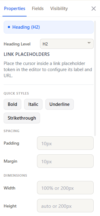 The Properties tab with the selected element chip at the top and grouped controls below.
Selected element
The top of the panel shows a chip naming the element you have selected. If nothing is selected, select an element on the canvas to populate the panel.
Element-specific controls
Depending on the selected element, one or more of these appear at the top of the panel:
| Control | Appears for | What it does |
|---|---|---|
| Heading Level | Headings | Sets H1–H6 |
| Section Label | Sections | Names the section (builder-only label, not rendered) |
| Column Width | Grid columns | Sets a column's share of the layout |
| Link Placeholders | Text with inline link tokens | Configures the label and URL for a link placeholder — place the cursor inside the token to edit it |
| Header Styles | Tables | Header row alignment (H Align, V Align), Font Weight, Background, and Text Color |
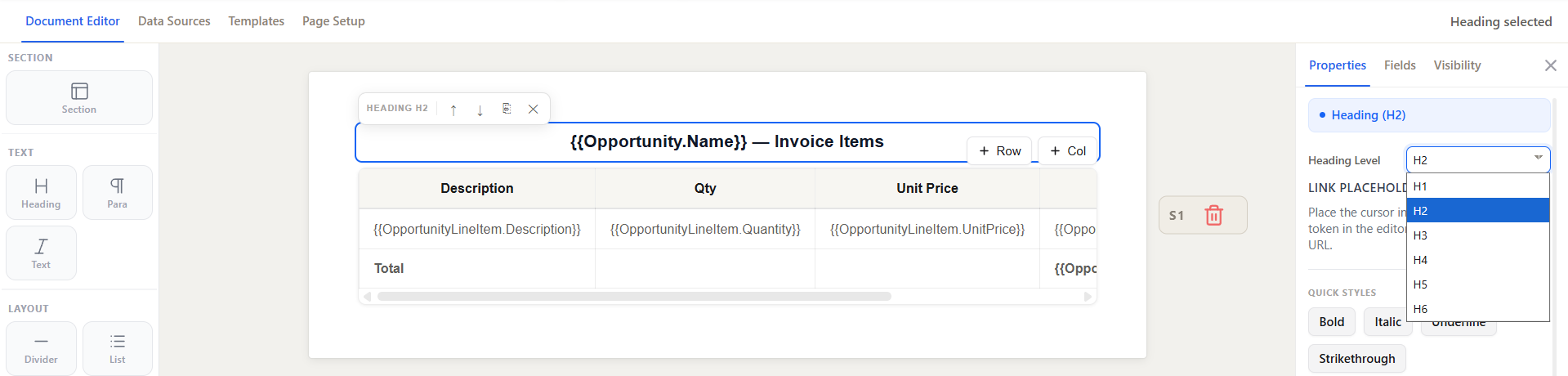 Heading Level picker shown when a Heading element is selected.
Quick Styles
One-click toggles for common text styling — Bold, Italic, Underline. The active state is highlighted so you can see what is applied.
Spacing
- Padding — space inside the element, between its border and content.
- Margin — space outside the element, between it and its neighbors.
Both accept per-side values so you can, for example, add bottom margin without affecting the top.
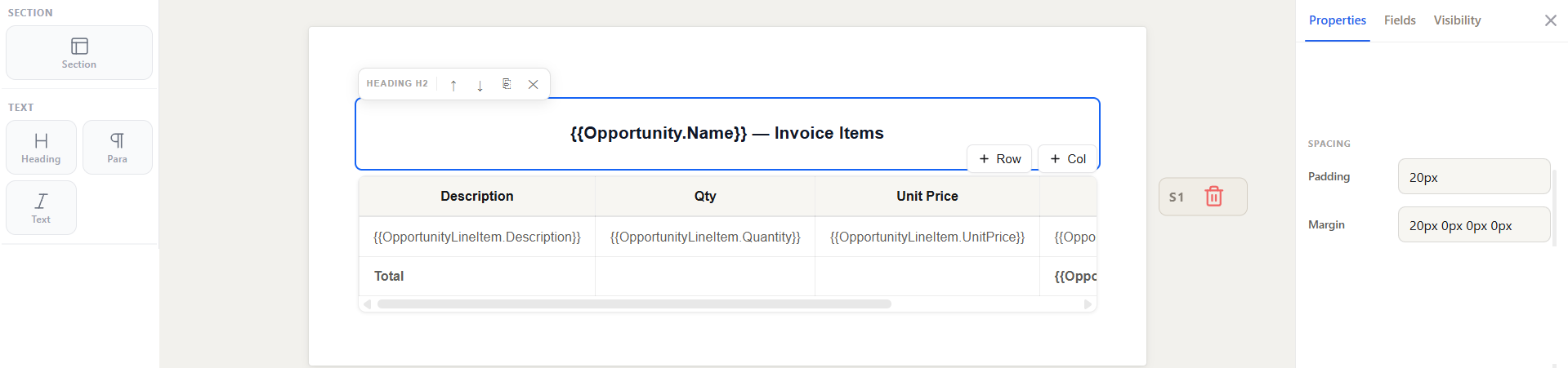 Padding and Margin controls under the Spacing group.
Dimensions
- Width and Height — set an explicit size for the element.
- Border — add a border around the element.
- Gap Between Columns — for grid layouts, the space between columns.
Typography
- Font Family
- Font Size
- Font Weight
- Line Height
- Text Align
These cascade the same way CSS does — set a value on a section and child elements inherit it unless they override it.
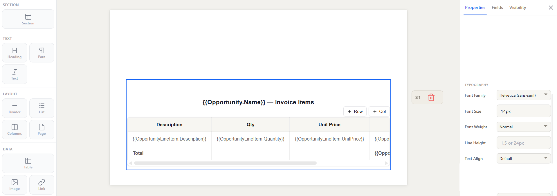 Typography group: font family, size, weight, line height, and alignment.
Colors
- Color — the text color.
- Background — the element's background color.
See also
- Text Elements, Layout Elements, Data Elements — the elements you style here
- Conditional Visibility — the Visibility tab in the same panel